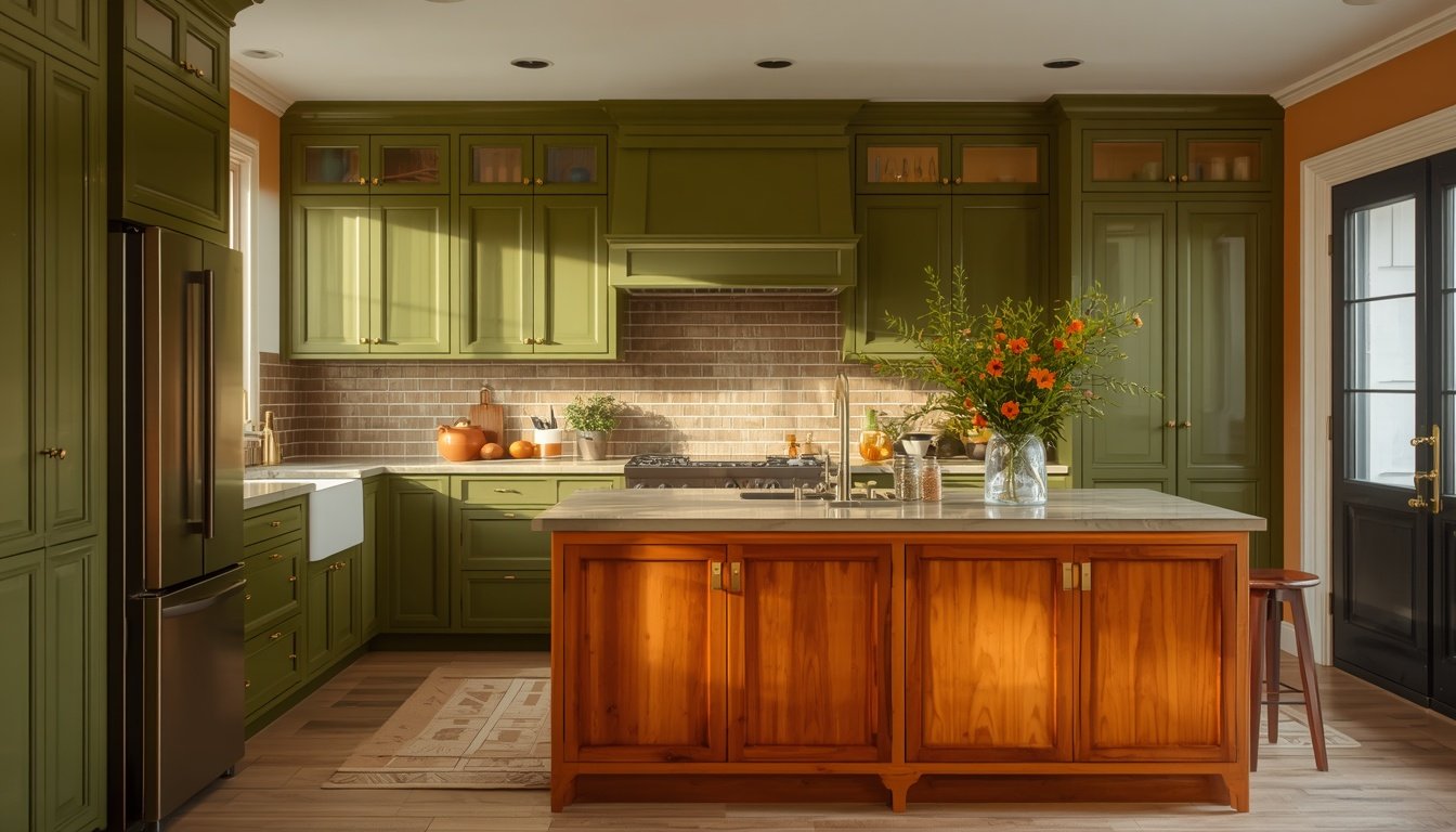
How to Make a Colorful Kitchen Look Like It Belongs in a Magazine
Scrolling through colorful kitchen ideas and wondering how some kitchens look effortlessly magazine-worthy while others feel like a paint store exploded? You’re not alone. The truth is, the best colorful kitchen ideas aren’t about throwing every shade you love onto the walls — they’re about knowing exactly which colors to commit to and how to balance them.
Whether you’re drawn to a saturated olive green island, a bold navy backsplash, or a full monochrome blue kitchen, the right colorful kitchen ideas can turn the most-used room in your house into a space with genuine personality. In this guide, we’re breaking down 15 designer-approved ways to make a colorful kitchen look intentional, sophisticated, and completely magazine-worthy — no full renovation required.
Why Colorful Kitchens Are Having a Major Design Moment
For years, the safe move was neutral everything – white cabinets, gray countertops, beige walls. Neutral kitchens are timeless, sure, but they can also feel a little impersonal, like a staged listing photo rather than an actual home.
Colorful kitchens flip that script. They turn the most-used room in your house into a space with genuine character – one that feels specific to you instead of generic enough to appeal to anyone. And honestly, once you commit to a good palette, the design possibilities open up in a way plain white cabinets just can’t match.
1. Start With One Statement Color, Not Five
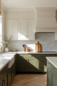
Here’s the biggest mistake I see people make: trying to use every color they love all at once. A magazine-worthy colorful kitchen almost always starts with one dominant color, with everything else playing a supporting role.
Pick your statement color first – maybe it’s a deep olive green or a saturated blue – and build the rest of the room’s palette around it. This single decision keeps the space feeling curated instead of chaotic.
2. Choose a Cabinet Color That Sets the Whole Tone

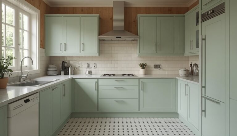
Your cabinets take up the most visual real estate in the kitchen, so this is where your color choice matters most. Deep, saturated tones like emerald green, navy, or a rich olive tend to photograph and age better than trendy pastels.
A few cabinet color combos that consistently work:
- Olive green lowers + white uppers – grounded but not heavy
- Deep navy island + white surrounding cabinetry – classic contrast
- Full emerald green cabinetry – bold and cohesive
3. Pair Your Color With the Right Complement
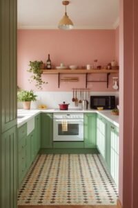
Color pairing is where a lot of colorful kitchens either succeed or completely fall apart. The right color pairing makes a bold kitchen feel intentional; the wrong one makes it feel like a mistake.
Some tried-and-true combinations designers keep coming back to:
- Yellow and blue – cheerful, almost coastal
- Pink and green – soft, classic, surprisingly timeless
- Lavender and gold – quirky and a little regal
- Yellow and gray – playful but grounded
IMO, this is the step that separates amateur color choices from professional ones. Don’t just pick colors you like individually – pick colors that talk to each other.
4. Add a Bold Backsplash Without Overwhelming the Space
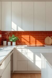
If painting your entire kitchen feels like too big a commitment, a colorful backsplash is the easiest low-risk way to test out bold color. Glossy tile in an unexpected shade – think orange, terracotta, or deep teal – adds instant personality without the same commitment level as cabinetry.
The bonus here? Backsplashes are relatively cheap to redo later if your taste changes. Not a huge investment, not a huge renovation – just a smart way to dip your toes into color.
5. Let the Island Be Your Color Statement Piece
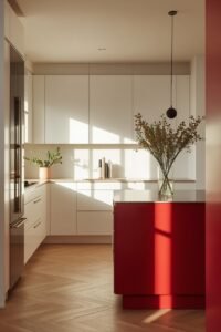
Not ready to commit your whole kitchen to color? Paint just the island. This is one of the most popular tricks in colorful kitchen design because it delivers maximum visual impact for minimal repainting.
A ruby-red, teal, or navy island against neutral surrounding cabinetry creates an obvious focal point the second you walk in. It’s a smaller area to paint but it does most of the visual heavy lifting.
6. Bring in Color Through Pendant Lighting

Lighting fixtures are one of the most underrated ways to add color. A trio of colorful pendant lights above your island injects personality without touching a single cabinet.
This is the kind of change you can make in an afternoon, and it’s completely reversible if you change your mind later. Multi-colored striped pendants or a single bold hue both work – just make sure the shade complements your existing palette instead of fighting it.
7. Use Wallpaper to Add Pattern and Personality
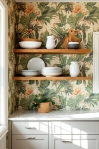
Sometimes solid color isn’t enough – you want pattern too. Wallpaper is one of the fastest ways to transform a plain kitchen wall into a full design statement, whether that’s a tropical print, a bold floral, or an abstract pattern.
An accent wall behind open shelving works especially well here. The wallpaper becomes a backdrop that makes even a jumble of dishes and cookware look intentional rather than cluttered.
8. Mix Color With Natural Materials

Bold color needs grounding, and natural materials like wood, stone, and brass keep a colorful kitchen from feeling flat or cartoonish. Walnut cabinetry paired with a dusty rose wall, or warm wood flooring beneath a saturated blue island – these combinations feel sophisticated rather than loud.
This is honestly one of my favorite tricks. A bold color on its own can feel a little one-note, but pair it with a natural material and suddenly the whole room feels layered and considered.
9. Don’t Forget the Ceiling – It’s an Easy Color Opportunity
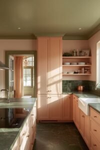
Most people paint the walls and stop there. A painted ceiling – sage green, sunny yellow, even a soft periwinkle – ties the whole color story together in a way that flat white ceilings simply can’t.
It’s a small move that most guests won’t consciously notice, but it’s exactly the kind of detail that makes a space feel professionally designed instead of DIY’d.
10. Add Color Through a Retro or Statement Appliance

Not everyone wants to commit to paint. A retro-style refrigerator or a boldly colored range is an easy way to add a focal point without touching your cabinetry at all.
This works especially well in an otherwise neutral kitchen – one colorful appliance becomes the star of the show, and everything else quietly supports it.
11. Balance Bold Color With Neutral “Base Notes”
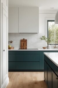
Even the boldest colorful kitchens need a resting point for the eye. Dark teal lower cabinets, for example, need plenty of white, cream, or light wood around them to keep the space from feeling heavy or closed in.
Think of your neutral elements as a base note in a perfume – you might not notice them directly, but they’re doing the work of holding everything else together.
12. Use Tile Beyond the Backsplash
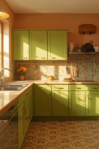
Why stop at the wall? Patterned or colorful tile on countertops or floors adds a retro, high-impact touch that instantly elevates a kitchen from “nice” to “unforgettable.”
Pairing a colorful geometric tile with a bold cabinet color – like lime green cabinetry against a graphic tile countertop – creates the kind of high-contrast look that photographs beautifully and feels genuinely unique.
13. Layer in Color Through Accessories and Open Shelving
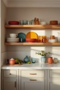
If you’re not ready for a full renovation, open shelving styled with colorful dishware, glassware, and collected objects is a completely reversible way to bring color into a neutral kitchen.
This is a great starting point if you’re testing the colorful-kitchen waters before committing to paint. Swap it out anytime, no regrets.
14. Go Monochrome for a Sophisticated, Editorial Look
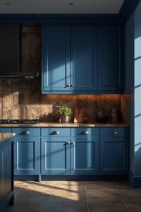
Colorful doesn’t always mean multiple colors. A monochrome kitchen – one saturated hue used across cabinetry, backsplash, and walls – reads as incredibly sophisticated and intentional.
A single shade of blue from countertop to ceiling, for instance, feels calm and cohesive rather than busy. This is one of the easiest ways to go bold without the risk of clashing colors.
15. Mix Two Bold Colors Like a Professional Designer
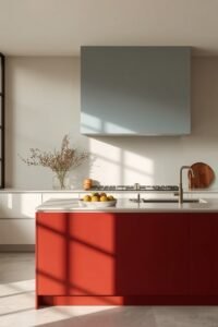
Once you’re comfortable with color, try combining two saturated shades instead of one – think a red island paired with a pale blue-gray range hood, or lavender walls against a deep navy island.
This is a more advanced move, so don’t attempt it as your very first color experiment. But when done well, it’s exactly the kind of detail that makes a kitchen look like it was designed by a professional, not thrown together on a whim.
Popular Colorful Kitchen Palettes to Try
Not sure where to start? Here are five combinations that consistently photograph well and hold up over time.
Olive Green + Warm Wood
Grounded, period-appropriate, and pairs beautifully with brass hardware. Works especially well in midcentury or transitional kitchens.
Saturated Blue + Brass
Dramatic without feeling cold. A deep, vibrant blue paired with warm brass fixtures reads as both bold and elegant.
Blush Pink + Sage Green
Soft, classic, and surprisingly versatile. This combo works in traditional and modern kitchens alike.
Acid Yellow + Charcoal
High-energy and contemporary. Best used in smaller doses – think lower cabinets only – so it doesn’t overwhelm.
Terracotta + Cream
Warm, earthy, and endlessly cozy. A great option if you want color without going full saturated-hue.
Common Mistakes That Make a Colorful Kitchen Look Cheap Instead of Chic
A few pitfalls to avoid on your way to a magazine-worthy space:
- Using too many colors at once – stick to one dominant hue plus a complement
- Skipping neutral “resting points” – every bold color needs somewhere for the eye to relax
- Choosing trendy shades over timeless ones – a very trendy pastel can date quickly
- Ignoring your hardware finish – mismatched metals fight with your color choice instead of supporting it
- Painting everything the same shade of the same color – depth and variation matter more than uniformity
How to Keep a Colorful Kitchen From Feeling Too Busy
The secret isn’t restraint – it’s structure. Pick one dominant color, one complementary accent, and one neutral base, and stick to that formula throughout the room. Every additional color you introduce should relate back to that core palette instead of competing with it.
This is also where natural materials come back into play. Wood, stone, and brass all act as visual “breathing room” between bold color choices, keeping even a maximalist kitchen from tipping into overwhelming territory.
Frequently Asked Questions
What colors make a kitchen look expensive? Deep, saturated tones like emerald green, navy, and olive tend to read as more expensive than bright pastels. Pairing them with warm metals like brass or unlacquered brass hardware pushes the high-end feel even further.
How do I add color to my kitchen without overdoing it? Start small – a backsplash, an island, or pendant lighting are all low-commitment ways to test a color before going all in on cabinetry or walls.
What’s the most popular kitchen color trend right now? Deep, saturated hues like olive green and rich blue continue to dominate, especially when paired with warm wood tones and brass accents rather than cool, stark contrasts.
Is a colorful kitchen a good investment if I plan to sell my home eventually? It depends on how bold you go. A statement island or backsplash is easy to repaint before selling, while full cabinetry in a very saturated color is a bigger commitment. If resale is a top concern, keep the boldest choices to easily reversible elements.
Final Thoughts: Confidence Is What Makes a Colorful Kitchen Work
At the end of the day, a colorful kitchen isn’t about following a strict rulebook – it’s about committing to a choice and executing it with confidence. The kitchens that look like they belong in a magazine aren’t the ones with the most colors. They’re the ones where every color choice feels deliberate.
Start small if bold commitment feels intimidating – an island, a backsplash, or even just a few pendant lights can completely shift how your kitchen feels. And once you see how much personality a single well-chosen color can bring to a room, going back to plain white cabinets might be a lot harder than you think 🙂