What Your Sofa Color Says About Your Living Room (Color Psychology)
There’s this moment when you’re standing in a furniture store, staring at a sea of sofas, and you just freeze. Gray or navy? Beige or blush? And you think — okay, I’ll just go with what looks nice. But honestly? Your sofa color is doing a lot more work than you realize. It’s basically setting the emotional temperature of your entire living room before anyone even sits down.
Color psychology is a real thing, and once you know even a little bit about it, you start seeing your space completely differently. Not in a complicated, interior-designer-jargon kind of way — just in a “oh, that’s why I feel restless in this room” kind of way.
The Gray Sofa Problem Nobody Talks About
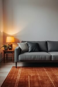
Gray sofas are everywhere. Like, everywhere. And I get it — they’re safe, they’re versatile, they go with basically any wall color. But here’s the thing about gray: it’s psychologically neutral in a way that can tip either into calm or into cold, depending on everything around it.
Cool grays especially — the ones with blue or green undertones — can make a room feel a bit detached. Clinical, almost. Not cozy. A warm gray, though? That’s a different story. Throw in some amber lighting, a chunky knit throw, wooden accents, and suddenly that same neutral sofa feels like a hug.
I had a gray sectional for three years and kept wondering why the room never felt quite right. Turns out I had a cool-toned gray against warm white walls and it was just… fighting itself the whole time. Added a rust-colored rug and suddenly the whole vibe shifted. That was a fun realization to have after three years.
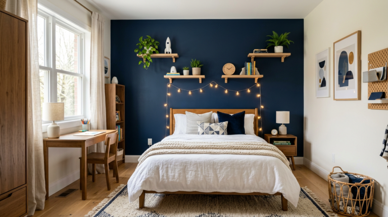
Blue Sofas — More Calming Than You’d Expect

Navy, cobalt, dusty blue, teal — blue sofas are having a major moment and honestly they deserve it. Blue is one of the most universally calming colors in psychology. It lowers heart rate slightly, reduces stress, makes people feel more at ease. Which is kind of perfect for a living room, right?
Navy in particular has this grounding quality. It feels serious but not heavy. Dusty or slate blue is softer — better for smaller rooms or spaces where you want that relaxed, almost bedroom-level calm. Teal is a bit more energetic because of the green in it, and it works really well if your space gets good natural light.
The main thing people worry about with blue sofas is that they’ll feel cold. That’s only really true if you pair them with other cool tones and skip warm accents entirely. Bring in brass hardware, warm, earthy tones that work beautifully with blue, warm wood floors, terracotta or burnt orange throw pillows — blue becomes incredibly inviting.
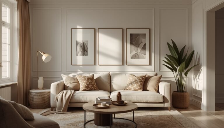
What a Beige or Cream Sofa Is Actually Saying

Warmth. Ease. A kind of quiet confidence, honestly. Beige sofas get dismissed as boring sometimes, but in color psychology, warm neutrals create a sense of openness and approachability. Rooms with beige or cream sofas tend to feel larger, lighter, and more breathable.
There’s a reason so many professionally staged homes use cream or linen-colored sofas — they create this blank, airy canvas that lets the rest of the room speak. The practical side, though, is real. Kids, pets, red wine, coffee. My neighbor went with a cream sofa when she redid her living room and lasted about eight months before covering it with a slipcover. No judgment, cream sofas are beautiful but they require a level of commitment.
If you love the look but want something slightly more forgiving, choosing warm neutral tones for your home like warm greige (gray-beige) gives you almost the same visual energy with a bit more flexibility.
The Bold Green Moment — And Why It Works Psychologically

Emerald, olive, sage, forest green — green sofas have gone from unexpected to genuinely desired, and color psychology explains exactly why they feel so good. Green is the color most associated with nature, balance, and renewal. It’s one of the easiest colors for human eyes to process, which means it literally creates less visual strain.
Sage green in particular feels incredibly grounding right now. It’s not trying too hard. It pairs beautifully with natural, earthy design ideas — rattan, linen, jute — and it has this earthy, lived-in quality that makes a space feel genuinely relaxed rather than styled-within-an-inch-of-its-life.
Olive is a little moodier, a little more sophisticated. Emerald is bolder — it has energy, it makes a statement. But here’s the thing about bold green sofas: they tend to make people feel at home faster than almost any other color. There’s something about green that feels inherently safe.
Red and Orange Sofas — High Energy, High Risk, High Reward

Okay so these are the bold choices. Red is stimulating — it raises energy, creates excitement, increases appetite even. Orange is warmer and slightly more social, associated with enthusiasm and warmth. Both are genuinely powerful in a living room if that’s the vibe you’re going for.
The risk is that they can become visually exhausting if the rest of the room doesn’t balance them out. A bright red sofa in a small room with low ceilings and not much natural light? It can feel overwhelming pretty fast. But a deep brick red or terracotta-leaning orange in a well-lit room with lots of natural wood and neutral walls? Absolutely stunning.
Not gonna lie — I used to think red sofas were a bold choice made by people who’d watched too many design shows. Then I saw one done really well in a real home, not a magazine, and completely changed my mind. It had this warm, almost Italian living room energy that felt effortlessly inviting.
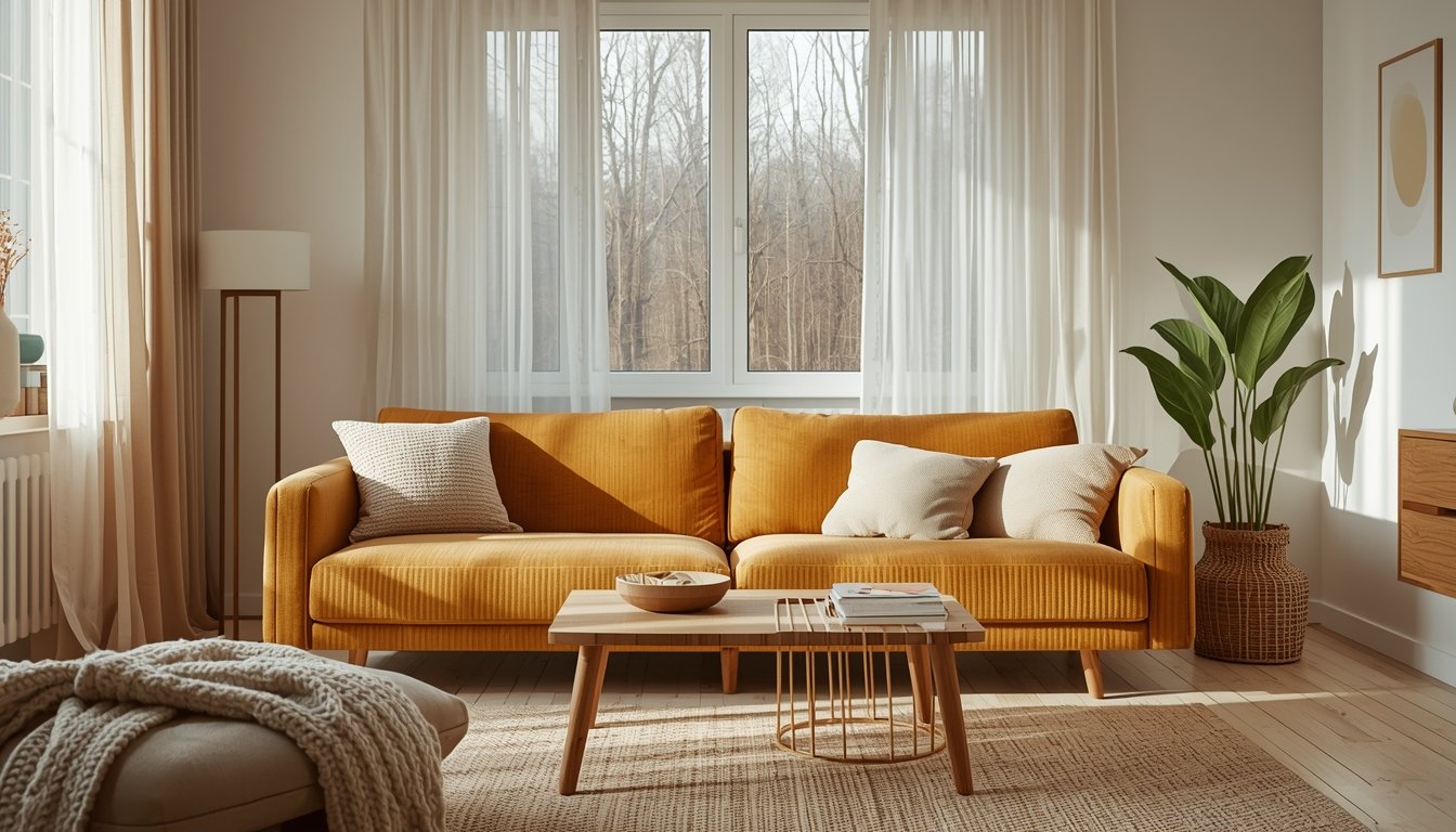
Yellow and Mustard — The Happiness Sofa
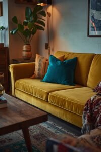
Yellow is the most psychologically complex color in home design. It’s strongly associated with happiness, optimism, and creative energy. But it’s also one of the hardest to get right because the wrong shade reads as anxious or even aggressive rather than cheerful.
Mustard is the sweet spot. It has enough brown and gold in it to feel warm and grounded rather than jarring. Mustard sofas specifically have this retro, eclectic quality — they work beautifully in rooms that mix patterns, textures, and eras. Pair with deep teal, forest green, rust, or even blush and you’ve got something genuinely interesting.
Bright or cool-toned yellow sofas are harder. They can work in very specific spaces — lots of light, white walls, minimal other colors — but they’re unforgiving. If the shade is even slightly off, the room can start to feel like a fast food restaurant. That’s not the vibe.
Blush and Pink Sofas — Not Just for One Type of Person
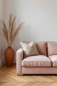
Pink sofas have had a whole reputation makeover in the last few years. Blush especially — that muted, dusty rose tone — reads less as “feminine” and more as warm, textured, and sophisticated. Color psychology links soft pink with tenderness and calm, which actually makes it a pretty ideal living room color when handled right.
The key is treating blush like a neutral rather than a statement. Pair it with warm whites, natural linen, light wood tones, maybe some terracotta accents. Don’t overthink it. Blush sofas in well-lit rooms with high ceilings feel genuinely elevated — not cute-girly, but considered and calm.
Dusty mauve is similar but has more gray in it, which makes it even more versatile and a little less obviously pink if that’s a concern for anyone sharing the decision-making.
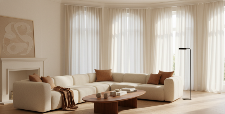
Dark Sofas — Charcoal, Black, Deep Brown
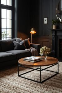
Dark sofas are underrated in a specific way. People assume they’ll make a room feel smaller or heavier, and yes, in a tiny room with dark walls and no light sources, that’s true. But in the right setting — good natural light, lighter walls, warm accent colors — dark sofas anchor a room beautifully.
Charcoal is incredibly practical and has this quiet, grounded energy. Deep brown leather especially has warmth that feels almost timeless. Black sofas can go two ways — modern and sharp, or heavy and dramatic — depending entirely on what surrounds them.
Color psychology-wise, darker furniture colors create a sense of security and permanence. The room feels established. Settled. There’s something about a dark sofa that says this living room is serious in the best possible way.
One More Thing — The Room Talks Back
Here’s what a lot of color psychology guides skip: your sofa color doesn’t exist in isolation. How design elements work together in smaller spaces — the wall color, the flooring, the lighting, the size of the room — all of it is in constant conversation with your sofa. A navy sofa in a bright white room feels modern and coastal. The exact same sofa in a dark-paneled room feels moody and library-like. Same sofa, completely different psychological experience.
So when you’re choosing, don’t just think about whether you like the color. Think about what you want the room to feel like when you walk in. Energizing or calm? Cozy or airy? Grounded or playful? Start there, then work backward to the color.
And if you’re still stuck — honestly, a warm neutral is never wrong. You can always add personality with everything else around it.
Meta description: