Designer Tricks to Pick a Luxury Living Room Color Palette
There’s something almost paralyzing about standing in a paint store holding fifteen color swatches and feeling absolutely zero confidence. I’ve been there. You want your living room to feel expensive, pulled-together, curated — but every time you try to build a color palette, it either ends up looking like a hotel lobby or like someone threw a bag of crayons at the wall.
Picking a luxury living room color palette doesn’t have to feel complicated. And honestly, the designers who make it look effortless? They’re following some really specific rules that nobody talks about out loud.
Let me share what I’ve learned — from obsessing over design accounts, redoing my own living room twice (yes, twice), and picking the brain of a designer friend who has seen enough living room disasters to write a book.
Start With a Feeling, Not a Color
This is the thing most people skip and it ruins everything. Before you even think about paint chips or fabric swatches, ask yourself: how do you want to feel when you walk into this room?
Calm and floaty? Moody and dramatic? Warm and wrapped-up? Those feelings point directly to specific color families, and that’s your real starting point.
Designers call this the “emotional anchor” of a room. My designer friend calls it simpler — she says “pick your vibe before you pick your beige.” Which honestly tracks.
If you want calm and airy, you’re probably drawn toward soft neutrals, dusty blues, sage greens, warm whites. If you want drama, you’re looking at deep navy, charcoal, forest green, warm black. Neither is more “luxury” than the other — it’s the execution that makes it feel elevated.
The 60-30-10 Rule Is Real and You Should Use It
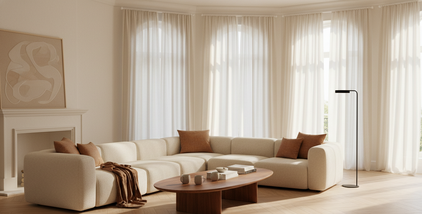
Okay this one sounds like homework but it’s actually just a simple split that keeps things from going chaotic. Sixty percent of the room gets your dominant color — usually walls, large sofa, or a big area rug. Thirty percent goes to secondary color — accent chairs, curtains, maybe a console table. And ten percent is your pop — throw pillows, a vase, a lamp, a piece of art.
Not gonna lie, when I first applied this to my own living room I was a little skeptical. But the before and after was genuinely surprising. Everything just settled. It stopped looking like random things I liked and started looking like a room someone designed on purpose.
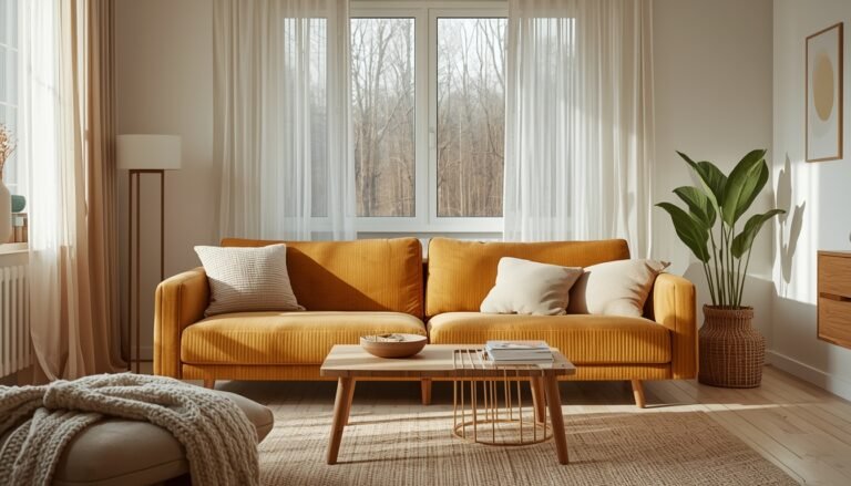
For a luxury feel, that 10% pop color is where you go a little bolder. A dusty rose cushion in a charcoal and taupe palette is subtle but it’s what makes people walk in and go “okay, this feels expensive.”
Warm Neutrals Over Cold Ones — Almost Always
Here’s something I notice every time I see a living room that feels off but nobody can explain why: it’s usually too cold. The whites are too stark, the grays are too blue-toned, and the whole thing feels like a dentist office that got a little too Pinterest-ambitious.
Luxury spaces lean warm. Think cream instead of white. Greige instead of gray. Tan instead of beige-with-a-blue-undertone.
Warm undertones in a room do something really specific — they make the light look better. Natural light bounces differently off warm surfaces. It glows a little. Cold surfaces just reflect and flatten the light, and the whole room starts to feel sterile.
Benjamin Moore Pale Oak, Sherwin Williams Accessible Beige, Farrow & Ball Elephant’s Breath — these keep coming up in high-end spaces because they’re warm, soft, and they work with almost every warm or cool accent you throw at them. Not because designers are lazy and just pick the same things. Because they genuinely work.
The One Color You’re Probably Ignoring
Wood. Actual wood tones — your floors, coffee table, bookshelves — these are colors too. So many people plan their whole palette without accounting for the existing wood in the room and then wonder why their carefully chosen paint looks weird on the walls.
If you have warm honey-toned wood floors, you have a warm-palette room whether you like it or not. Going for a cool gray and white situation is going to fight with your floors the whole time.
Dark espresso floors? You can go cooler. Lighter driftwood-style wood? Warm it up even more. The point is — look at what’s already in the room before you commit to anything. Designers always start here.
My neighbor redid her living room last summer and did everything right — gorgeous sage green walls, beautiful cream sofa — and then it looked somehow wrong and she couldn’t figure out why for weeks. It was the floor. She had very orange-toned pine floors and the sage was slightly blue-green. The undertones were fighting. Once she swapped the sage for a more yellow-green, the whole room clicked.
How Many Colors Is Too Many Colors
The magic number for a luxury palette is three to four. That’s it. Not ten, not two, not “just keep adding things until it feels done.”
One dominant neutral. One mid-tone that adds depth. One warm or cool accent. And maybe one deep anchor — something in pillows, art, or a side table that gives the eye a place to rest.
The temptation is always to add more. More color, more pattern, more personality. And I get it. But the rooms that feel truly expensive almost always have restraint built in. White space — or in this case, neutral space — is what lets the beautiful things actually show up.
Texture Is a Color (Kind of)
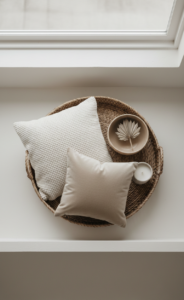
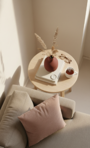
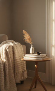
This one sounds weird but hear me out. In a room with a very tight color palette — like cream on cream on cream — what keeps it from feeling flat and boring is texture. Linen, velvet, bouclé, rattan, glazed ceramic, matte stone. These all read as visual color even when they’re technically the same hue.
A cream linen sofa reads differently than a cream velvet sofa. A white matte vase reads differently than a white glossy one. When you’re working with a limited palette, texture is how you add richness without adding more colors.
This is honestly something I wish someone had told me earlier. I kept thinking my room needed more — more color, more stuff — when actually it just needed different textures in the same color family. Once I added a bouclé throw and swapped out a glossy side table for a matte wood one, the room suddenly felt layered and warm instead of bare.
Test Before You Commit — Seriously
Everyone says this and no one actually does it. Paint the wall. A real section, not just a tiny swatch card held up in the middle of the room. Paint a two-foot by two-foot patch and live with it for three days.
Look at it in morning light. Look at it at noon. Look at it in the evening with lamps on. The same color can look completely different at different times of day and that shift can make or break your whole palette.
Same goes for fabric samples. Order them. Lay them on your actual sofa or floor. See how they look next to your wood, your walls, your rug. Designers do this every single time — they never commit from a screen or a catalog photo.
The Deep Accent Wall Trick
One thing designers do that instantly makes a room feel more intentional — they go darker on one wall. Not a trendy accent wall with a random color that clashes with everything. A deeper version of the main palette color.
So if your walls are a warm cream, the wall behind your sofa or fireplace goes to a soft caramel or warm greige. If your room is sage, one wall goes to a deeper forest tone. It creates depth without disruption because you’re staying in the same color family.
This works especially well in smaller living rooms because it gives the illusion of dimension. The room looks bigger and more architectural even though you didn’t change the layout at all.
What Designers Know About Black
Almost every luxury room has a touch of black somewhere. It doesn’t have to be much — a matte black lamp, a thin-framed piece of art, black hardware on a cabinet. But that little bit of black grounds the whole palette. It stops things from feeling too soft or too “Pinterest pastel.” It’s the punctuation mark.
I added a simple black iron candleholder to my living room shelf and I’m not exaggerating — it pulled the whole thing together. It was like the room had been a sentence without a period and that little piece of black was the period.
Color Palettes Worth Borrowing
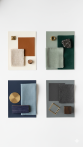
Not gonna give you a list of trendy colors to follow — trends date your space faster than anything. But here are a few palette directions that read luxury pretty consistently:
Warm cream + caramel + soft black + antique brass — this is that old-world rich feel. Think thick rugs, leather, linen.
Dusty sage + warm white + walnut wood + terracotta — earthy but elevated. Works really well with plants and natural light.
Deep navy + warm ivory + cognac leather + gold — classic, dramatic, and kind of timeless. Feels like a library but make it cozy.
Charcoal + blush + cream + matte black — soft drama. Feels moody without being dark.
None of these are revolutionary but they hold up because they’re built around warm undertones, limited colors, and a balance of light and dark.
One Last Thing

The most luxurious living rooms aren’t the ones with the most expensive furniture. They’re the ones where everything feels like it belongs together. The color is part of that — but it’s the decisions behind the color that really matter. Knowing your light, understanding your undertones, working with what you already have instead of against it.
You don’t need a designer budget to think like one. You just need to slow down a little before you pick up the brush.