2025 Exterior House Color Trends You Need to Know
There’s something about pulling up to a house and just knowing it looks right. The color, the trim, the whole vibe — it either works or it really doesn’t. And honestly, 2025 exterior house color trends are doing something interesting. It’s not the all-white everything phase anymore. It’s not the grey-everything era either (thank goodness). Something is shifting, and if you’re even halfway thinking about painting your house this year, you’ll want to keep reading.
The Quiet Exit of Grey and the Return of Warmth
I remember when every single house on my street went grey. One by one. Light grey, dark grey, blue-grey — it was like someone handed out a memo. And for a while it looked fresh. But somewhere around 2023 it started feeling… tired. Flat.
What’s trending now is warm. Not loud warm, not terracotta-on-every-surface warm, but warm undertones sneaking back into neutrals. Think creamy whites, soft greiges with yellow in their bones, and warm taupes that don’t feel cold even on a cloudy day. If you’ve been staring at your house thinking it looks a little lifeless, there’s a good chance the grey is part of that.
This doesn’t mean grey is dead — a really cool, deep charcoal with the right black trim still looks incredibly sharp. But the lighter greys with blue undertones? They’re starting to date a house.
Earthy and Organic is Having a Big Moment
If I had to pick the single biggest shift in 2025 exterior colors, it’s the move toward earthy, organic tones. We’re talking:
- Warm sage green (not minty, not army — warm and muted)
- Dusty clay and terracotta-influenced tones
- Soft ochre and golden wheat
- Deep olive that reads almost like a neutral
My neighbor painted her front door a dusty sage last spring and honestly I stopped my car to look at it. On a red brick house, of all things. It should not have worked that well. But paired with her white trim and black hardware, it looked like something out of a design magazine. Didn’t cost her more than a front door repaint.
These earthy tones connect to the larger trend of biophilic design — bringing nature’s palette into the built environment. But you don’t need to know that word to just see that these colors feel good. They feel grounded.
Deep, Moody Colors Are Not Going Anywhere
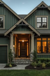
Not everyone wants soft and earthy. And honestly good — because deep, moody exteriors are still completely stunning in 2025. Deep navy. Forest green. Chocolate brown. Even a rich burgundy on the right house style.
What’s changing slightly is how people are using them. Instead of going dark everywhere, more homeowners are pairing a dark body color with a slightly lighter trim — or even a medium-toned trim — rather than the classic dark body + bright white trim combo. The effect is more layered, less stark. More intentional.
I saw a house last fall with dark forest green siding and a warm cream trim instead of white. It was so much softer than I expected from that color combo. Worth trying in a sample pot before you commit, obviously, but it’s a direction worth exploring.
What’s Actually Happening With White?
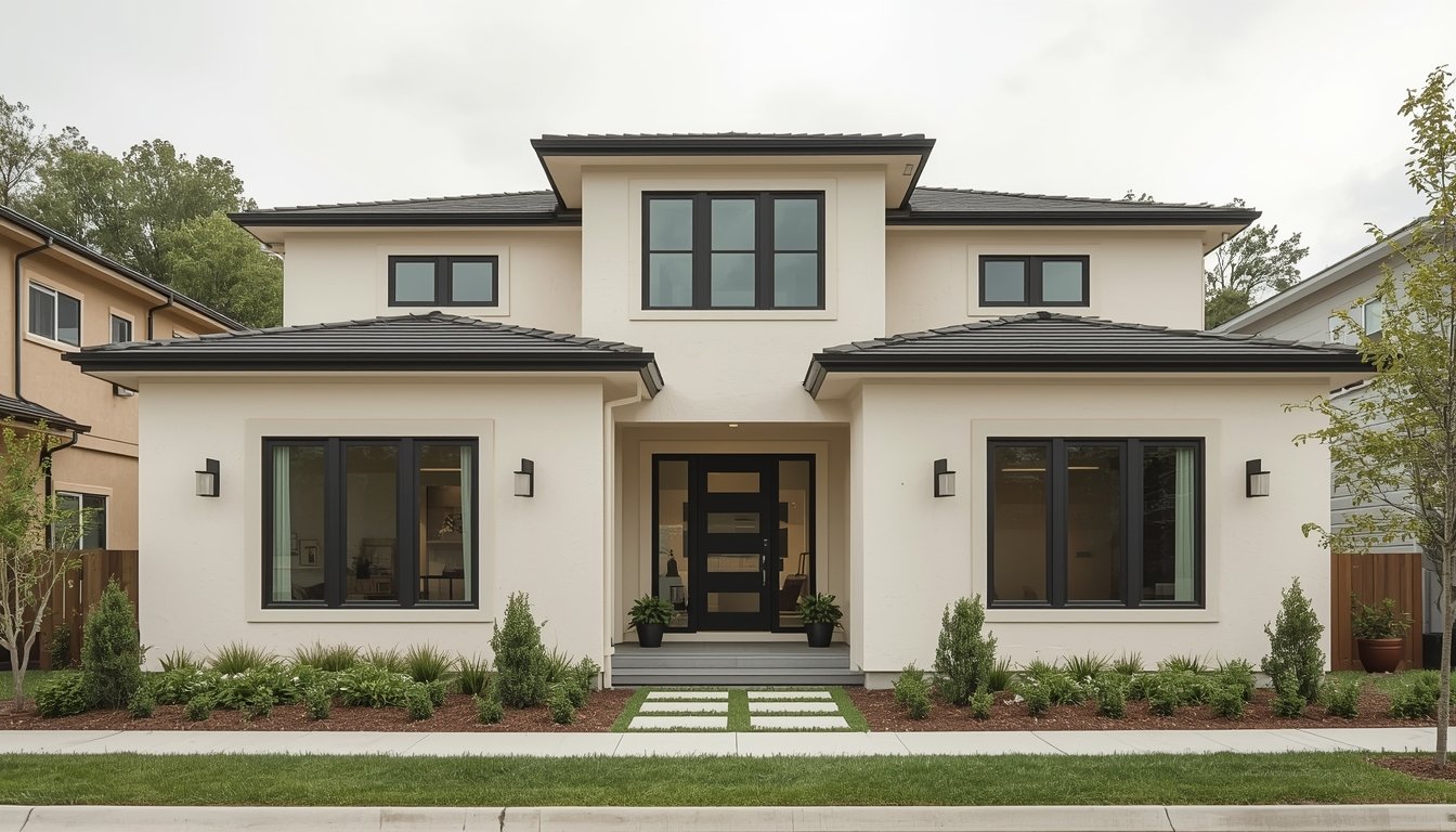
White is not going anywhere. Let’s be clear. But the bright, stark, almost blue-tinted whites are losing ground to warmer whites — those with just a hint of cream, linen, or yellow. Think the difference between copy paper white and a warm off-white linen.
Benjamin Moore’s White Dove, Sherwin-Williams’ Alabaster, anything in that warm white zone — those are having a real moment. If your house is currently a cool white and you’ve been wondering why it doesn’t photograph as warmly or look as inviting as others, the undertone is probably why.
Also worth knowing: warm whites pair beautifully with warm wood accents, warm-toned stone, and black or matte bronze hardware. Cool whites work better against grey roofing, blue stone, and silver-toned metals. It’s a small distinction but it makes a big difference up close.
The Trim Color Conversation Is Getting More Interesting
For a long time, the answer to trim color was just “white.” And sure, white trim is a classic. But 2025 is seeing a lot of experimenting with non-white trim, and some of it looks genuinely incredible.
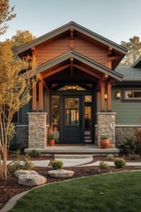
Matching trim to the body in a darker shade of the same color — tone-on-tone — gives a very modern, architectural feel. A greige house with a medium taupe trim. A sage green house with a deep olive trim. This works especially well on homes with interesting architectural details because it lets the shapes speak instead of the contrast.
Then there’s the black trim trend, which is still going strong, especially on lighter body colors. And warm wood elements as trim accents on modern or contemporary homes — think cedar wrapped columns or wood-look garage doors with a painted body. That combination is everywhere right now, and it doesn’t feel like it’s slowing down.
Colors That Are Starting to Feel Overdone
Honestly this section might ruffle some feathers, but.
The all-black house? Starting to feel like peak trend. Not wrong, just… we all know the look now. If you’re going for it, the execution has to be really polished or it can look unfinished.
Very saturated navy blues on traditional-style homes are also starting to feel like they peaked around 2022-2023. Still handsome, still classic — but probably not what you want if you’re trying to be ahead of the curve in 2025.
And the farmhouse look with board and batten in crisp white with black windows — it’s still charming, it’s just everywhere now. If that’s genuinely your style, own it. But if you’re doing it because it felt fresh, that freshness has largely passed.
What Your Roof and Surroundings Actually Dictate
This is the part people skip and then regret. Your exterior color doesn’t exist in a vacuum. The color of your roof matters enormously. So does your landscaping, your driveway material, your hardscaping.
A warm tan brick house with a charcoal roof will almost always steer better toward warm, earthy body colors — sage greens, warm taupes, creamy whites. That same house with a brown or black roof can actually pull off deeper greens and richer earth tones.
If your home has a lot of stone — especially cooler-toned stone like grey granite or blue flagstone — warm earthy tones might fight it. Cooler sage greens, blue-greys, or even a soft blue could actually harmonize better.
This is one of those situations where getting a physical paint sample and taping it to your actual house for a few days is worth every penny. Light changes. Morning versus afternoon is sometimes a completely different color.
A Few Colors That Are Quietly Trending and Underused
Here are a few colors that aren’t all over Pinterest yet but that are quietly showing up in designer projects and newer builds:
- Warm sand and buff tones — especially on stucco or smooth-finish homes. Not quite beige, not quite yellow. Very Mediterranean.
- Deep teal — not aqua, not turquoise. A dark, muted teal. It’s sophisticated and it works on craftsman and contemporary styles especially.
- Muted plum and mauve tones — just a whisper of purple in an otherwise neutral. Sounds wild, looks subtle and beautiful on the right style home.
- Warm terracotta — not orange, but a true clay tone, especially as an accent on stucco or in combination with creamy whites and warm wood.
Not all of these are for everyone. But if you’ve been craving something different and don’t want to go full bold, some of these in a slightly desaturated form can be the move.
The “Right” Color for Your Home Style
Quick reality check: trends matter less than your specific home style. A Victorian with wrap-around details in a minimal modern color palette will just look confused. A sleek contemporary doesn’t always benefit from a cozy cottage palette.
Generally speaking — craftsman homes love earthy greens, warm taupes, and rich browns. Ranch-style homes can pull off almost anything but look especially good in soft, warm, horizontal-feeling colors. Cape Cod and colonial styles tend to suit classic palettes — think warm whites, deep navies, or soft greys with punchy shutters. Modern and contemporary homes are where you can take more risks with moody darks, deep teals, and tone-on-tone approaches. And if you’re working with a barndominium or barn-style exterior, the same warmth and earthiness applies in a really big way — those homes thrive in deep greens, warm blacks, and rich wood tones.
If your home has architectural details worth highlighting — corbels, window trim, porch columns — contrasting but complementary trim colors will do that work beautifully. If your home is simpler in silhouette, a bolder body color can be the character.
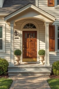
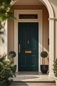
Don’t Forget the Front Door
A fresh front door color can do more work than an entire exterior repaint, budget-for-budget. In 2025, the colors landing hardest on front doors are:
- Deep forest green (still incredible, especially with brass or bronze hardware)
- Rich burgundy and oxblood reds
- Warm black (slightly less stark than a true jet black)
- Mustard and golden yellow on the right house
- Deep teal or peacock blue
If you’re not ready to commit to a full repaint, start with the door. Honestly, a $60 quart of paint and an afternoon is one of the best curb appeal upgrades you can make — I’m not exaggerating when I say it’s personally one of the most transformative things I’ve seen done to a home’s exterior for almost no money.
Changing your exterior color — even just a door, shutters, or trim — is one of the most impactful things you can do for your home’s personality. 2025 is a great year to experiment. The palette is wider now, the rules are softer, and there’s real room to do something that feels like you rather than just whatever everyone else was doing three years ago.
Take a sample pot. Tape it to the wall. Live with it for a week. Then decide.