Exterior Color Schemes That Make Red Brick Homes Pop
There’s something undeniably magnetic about a red brick home. That warm, earthy façade carries decades of character — sometimes centuries — baked right into every layer. But here’s the thing most homeowners overlook: the brick itself is only half the story. The trim, the shutters, the front door, the porch ceiling — every single one of those details either harmonizes with your brickwork or fights against it. Get the combination right, and your house becomes the one everyone slows down to admire. Get it wrong, and even the most beautiful masonry fades into the background.
So whether you’ve just moved into a classic Colonial, you’re refreshing a mid-century ranch, or you’re deep in a full exterior renovation, this guide is your starting point. These are color schemes that genuinely work — not just on a digital mood board, but in real light, through every season.
First, Understand What “Red Brick” Actually Means

Before you grab a paint swatch, take a long, honest look at your brick. “Red brick” isn’t a single shade — it’s a whole family. Some bricks lean orange-red with warm undertones. Others are a deeper burgundy, almost purple in certain light. Many older homes have weathered brick that’s a muted terracotta or a brownish clay tone.
This distinction matters enormously. A trim color that looks stunning against warm orange brick can clash terribly with cooler, darker masonry. Hold your paint chips directly against the actual bricks outdoors, in both morning and afternoon light. What works in the store under fluorescent lighting often surprises you once it’s on the house.
Classic Cream and Soft White Trim

If you want a combination that has never gone wrong and never will, cream-white trim against red brick is it. It’s not boring — it’s confident. The contrast is crisp without being jarring, and it lets the natural texture of the brick breathe.
The key here is choosing the right white. Pure bright white (think stark gallery walls) can actually look cheap or cold against warm masonry. Instead, reach for creamy off-whites: Benjamin Moore’s White Dove, Sherwin-Williams Alabaster, or Shoji White. These tones have just enough warmth to feel intentional rather than like you simply ran out of ideas.
Pair this with a deep charcoal or forest green front door and you’ve got a look that photographs beautifully in every direction — which, let’s be honest, is exactly what Pinterest is for.
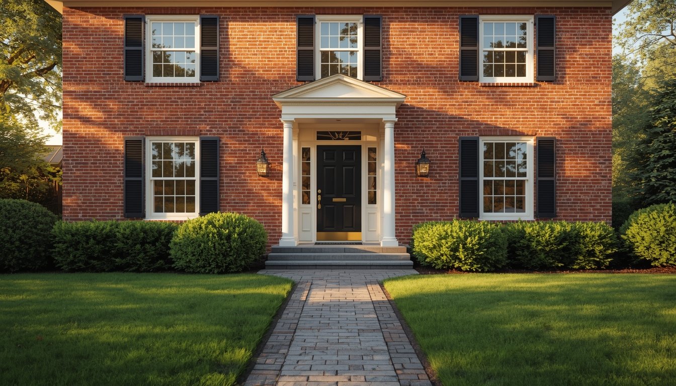
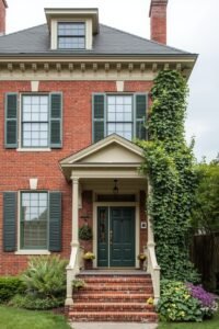
Black Shutters and Trim: The Bold Classic

Few combinations are as timelessly polished as red brick paired with black trim. It’s a look borrowed from traditional Southern architecture, Federal-style homes, and colonial farmhouses — and it translates effortlessly into modern design sensibilities.
Black doesn’t compete with the brick. Instead, it frames it, giving the entire exterior a sense of structure and intention. Matte black reads as more contemporary; glossy black leans traditional. Either way, it communicates that someone with genuine taste lives there.
If full black trim feels intense, try this instead: black shutters, soft white trim, and a glossy black front door. You get all the drama with better visual balance. Add brass or aged bronze hardware and a statement light fixture, and the whole façade pulls together with almost no effort.
Sage Green: The Color Combination Everyone Is Obsessing Over Right Now

Sage green and red brick is the exterior pairing that’s dominating design feeds at the moment — and for genuinely good reason. The soft, muted green picks up the earthy undertones in the brick while introducing something organic and unexpected. It feels both fresh and deeply grounded at the same time.
This works best when you commit. Go sage on the shutters, the front door, and maybe even the porch ceiling. Keep the trim a warm off-white or light cream. Avoid going too yellow-green or too bright — stick to dusty, weathered sage tones like Sherwin-Williams Pewter Green, or Farrow & Ball’s Mizzle if you want to invest a bit more.
Homes in wooded neighborhoods or those surrounded by mature trees look extraordinary with this combination. The green echoes the landscape and makes the brick feel rooted rather than out of place.
Navy Blue: Drama Without Going Overboard

Navy is one of those colors that seems daring in theory but somehow looks completely natural once it’s up. Against the warmth of red brick, a deep navy — whether on shutters, a front door, or trim accents — creates a rich nautical contrast that feels both classic and current.
Think of it like pairing a navy blazer with earth-tone chinos. The colors occupy completely different spots on the temperature scale, which is exactly why they work together. The brick warms things up; the navy keeps it sharp.
Benjamin Moore Hale Navy is a perennial favorite for this purpose. Sherwin-Williams Naval is slightly deeper and works beautifully on doors where you want maximum impact. Keep the rest of the trim neutral — a light gray or warm white — so the navy reads as an accent rather than a competition.
Warm Gray: The Modern Neutral That Still Feels Warm
Gray and brick sounds safe. And it can be — if you choose the wrong gray. But warm grays, the ones with beige or greige undertones, do something genuinely beautiful against red masonry. They modernize the exterior without stripping away any of the warmth or historic character the brick brings.
This is a particularly smart choice for mid-century ranch-style homes or craftsman bungalows where the goal is a cleaner, more contemporary profile. Pair a warm gray trim with a darker charcoal front door, and you land somewhere between traditional and transitional — a look that appeals broadly without feeling generic.
Avoid cool, blue-toned grays. They read as cold and slightly sterile against warm brickwork, and the visual temperature clash tends to make the house look unfinished rather than intentional.
Deep Hunter Green: For the Home That Wants to Own Its Setting
If sage green is approachable, hunter green is its more dramatic older sibling. Rich, saturated, and deeply rooted in traditional American architecture, hunter green against red brick creates an exterior that feels almost like it grew out of the landscape around it.
This is especially powerful on larger homes — Victorian styles, Colonial Revivals, or brick Tudors — where there’s enough visual real estate to handle the depth of color. Use it on shutters, the front door, and any painted porch elements. Keep the trim cream or antique white to prevent the whole thing from going too dark.
The result is a home that feels distinguished rather than just decorated. It has presence. It reads as intentional in a way that paler combinations sometimes don’t.
Terracotta Accents: Leaning Into What the Brick Already Does

Here’s a more unexpected suggestion: instead of contrasting the brick, lean into its warmth. Terracotta or rust-toned accents — on a front door, planter boxes, or even porch railings — pull from the brick’s own palette and create a cohesive, sun-warmed aesthetic that feels almost Mediterranean in the best way.
This isn’t about matching the brick exactly. It’s about staying within the same earthy family of tones. A deep terracotta door against warmer brick reads like everything belongs together, as if the house was designed as a complete piece rather than assembled in parts.
Pair this with a trim in warm linen or antique white and aged iron hardware for a finished look that’s genuinely singular. You won’t see this combination on every street — which is exactly the point.
The Details That Tie Everything Together

Here’s what most color guides skip: the door and shutters matter enormously, but so does everything else. Porch ceiling paint — traditionally haint blue in Southern homes, but increasingly a soft sky or sage — completely changes how an entryway feels. Garage doors painted to match the trim instead of contrasting with it create a much more unified front elevation.
Gutters and downspouts are another overlooked element. Black downspouts against red brick and cream trim look intentional and finished. Standard aluminum gutters in a mismatched tone can quietly undermine an otherwise thoughtful color scheme.
And light fixtures — even one well-chosen exterior sconce flanking the front door — can elevate the entire palette from “painted house” to “designed home.”
A Few Things to Avoid
Dark brown trim tends to muddy up against red brick rather than complement it — both colors compete for the same warm, earthy space and cancel each other out. Very bright or saturated colors on trim can overwhelm the brick rather than celebrate it. And painting over the brick itself, while sometimes the right call for severely weathered masonry, is a decision worth making with care. Once painted, brick is almost impossible to restore, so choose colors that work with what you have before considering coverage.
Final Thought
Red brick is a gift. It brings texture, history, and character that no painted surface can fully replicate. Your color choices aren’t there to compete with it — they’re there to frame it, complement it, and help it look like it was always exactly this intentional.
Whether you go classic with cream and black, unexpected with sage or terracotta, or timeless with navy and white, the right combination is the one that makes your specific brickwork look like the feature it already is. Trust the brick. Let the colors support it. The result will be worth every careful decision you made along the way.