How to Layer Living Room Wall Art to Optimize Focal Points
There’s this thing that happens when you walk into a living room and just feel it. You don’t even know why. The room looks pulled together, the walls aren’t screaming at you, and somehow everything makes sense. Nine times out of ten, someone thought carefully about their wall art — not just what they hung, but how they layered it.
Layering living room wall art isn’t complicated, but it does take a little intention. And honestly, most people skip this step entirely and then wonder why their gallery wall looks like a chaotic mess or their single framed print feels lonely and out of place.
Your Wall Has a Main Character — Find It First
Before you buy a single frame or rearrange anything, you need to figure out your focal point. In most living rooms, that’s either the wall behind the sofa, the fireplace wall, or whatever your eye goes to first when you walk in. Not every wall can be the star. Some walls are supporting cast.
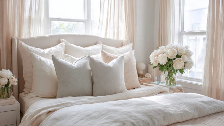
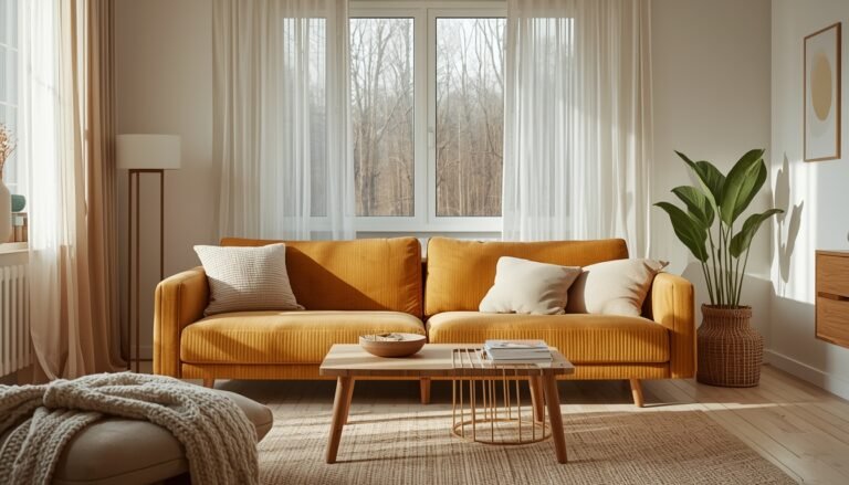
A lot of that same pulled-together feeling starts with understanding what your sofa color says about your living room — because your sofa is usually the anchor that everything on that focal wall needs to respond to.
I remember the first time I tried to make every wall interesting and it just looked exhausting. My eye had nowhere to rest. My neighbor actually pointed it out — gently, bless her — and said “it feels like the room is yelling at me.” She wasn’t wrong.
Pick one dominant focal wall. Everything else should support it, not compete.
The Anchor Piece Changes Everything
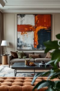
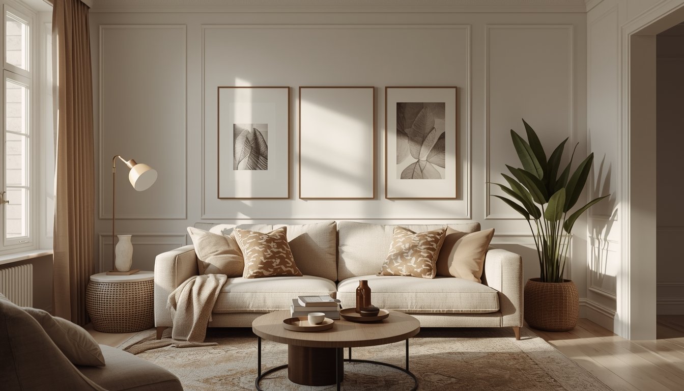
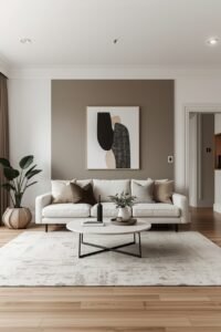
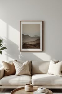
Once you’ve found your focal wall, you need an anchor — one piece of art (or a large mirror, or a statement print) that sets the tone for everything else. This is your largest piece, your most visually bold choice. It can be a painting, a dramatic black-and-white photo, a textile, whatever feels like you. But it needs to be able to carry a wall on its own before you layer anything around it.
Size matters here more than people admit. A lot of people go too small. Way too small. That 8×10 print on a massive wall above a six-foot sofa? It’ll just float there looking lost. If you’re unsure, go bigger than feels comfortable. You can always pull it back. Going too small is much harder to fix visually.
Layering Isn’t Just About What You Hang — It’s About Depth
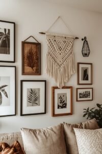
Here’s where it gets interesting. Real layering isn’t just “hang multiple pictures.” It’s about creating visual depth — bringing some things forward and pushing others back. You do this by mixing textures, frames, and even the way things sit at different heights.
Think about mixing a framed canvas with a woven wall hanging. Or a metal sculpture piece next to a flat print. The variation in texture makes the whole arrangement feel more organic, less like a showroom. Not gonna lie, this surprised me when I first tried it — adding a simple macrame piece next to my gallery wall made the whole thing feel way less flat and rigid.
Some things to play with:
- Frames: Mix wood, metal, and frameless pieces. Not everything needs to match.
- Mediums: Prints, paintings, mirrors, 3D objects, textiles — variety creates depth.
- Sizes: You want a range, not uniformity. Big, medium, small together reads as intentional.
The Grid vs. The Organic Cluster (And When to Use Each)
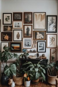
There are basically two schools of thought on gallery walls — the tight grid arrangement (very clean, very intentional) and the organic cluster (more eclectic, layered over time). Neither is better. They just serve different rooms and different personalities.
A grid works beautifully in more modern or minimal spaces. Same-size frames, even spacing, perfectly symmetrical. It’s calming. Very editorial. But if your room has a lot of personality already — like mixed furniture styles, collected objects, plants, colorful textiles — a strict grid can feel weirdly stiff.
The organic cluster feels like a room that evolved naturally. You start with your anchor piece, then add outward. Odd numbers usually feel better (3, 5, 7 pieces). Frames can vary. Spacing can be a little looser. It’s more forgiving and honestly, a lot more fun to build over time.
Height Is the Part Most People Get Wrong
Hang things at eye level. Not “eye level when you’re standing in the kitchen” eye level — eye level when you’re sitting in the room. Because that’s where you spend most of your time.
Most art gets hung too high. I’ve done it myself. You hang something, step back while standing, and it looks fine. Then you sit down and suddenly the art is practically on the ceiling. For living rooms, think about centering your main piece or arrangement around 57-60 inches from the floor — which is roughly gallery standard — but adjust down a few inches if your sofa is low-profile.
When you’re layering multiple pieces, the center of the whole arrangement should hit that height, not just the top piece.
Don’t Forget What’s Below the Art
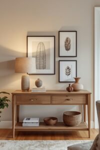
This is something that doesn’t get talked about enough. The art doesn’t exist in a vacuum — it relates to whatever is below it. A sofa. A console table. A fireplace mantle. Layering works best when you think about the art and what’s beneath it as one visual unit.
If you have a console table under your gallery arrangement, use it. A lamp, a small vase, maybe a leaning frame or two. That lower layer grounds everything above it and makes the whole wall feel like a composed moment rather than just stuff on a wall. Honestly, this kind of intentional object styling — thinking about what sits below and around a focal display — follows similar instincts to how landscapers think about styling outdoor planter boxes: you layer heights, textures, and visual weight to make the whole thing feel cohesive rather than random. My own living room changed dramatically once I stopped treating the art and the furniture as separate decisions.
Color Flow — The Secret Glue
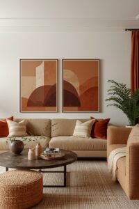
Your art doesn’t need to match perfectly. But it does need to relate. There should be some thread of color that moves through the arrangement — even loosely. It could be a warm neutral tone that shows up in three different pieces. Or a specific shade of terracotta that echoes across prints. Or just a consistent mood (all moody darks, all airy soft tones).
The way color relationships work throughout a space is something designers think about far more deliberately than most people realize — and if you’ve never dug into how to build a luxury living room color palette, it genuinely changes how you see art selection too. You start picking pieces that belong in the room rather than pieces you just like in isolation.
When pieces are completely random in color with no visual relationship, the eye doesn’t know where to go. It doesn’t need to be matchy-matchy — that actually looks worse. It just needs that subtle thread.
Leaning Is Underrated
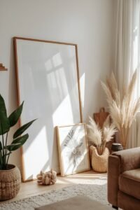
Not everything needs to be nailed to the wall. Leaning large art or framed mirrors against the wall — especially on the floor — adds this effortless, almost undone quality that feels very collected and lived-in. It’s also great if you’re renting or just not ready to commit.
A large leaning mirror next to a gallery wall, for instance, bounces light around and makes the whole display feel bigger and airier. Or a big canvas leaned on a console behind a couple of small decor objects. It layers depth in a really natural way.
When to Leave a Wall Alone
This might be the most underrated advice: not every wall needs art. Seriously. Some walls are better left quiet. A pale empty wall can make the other walls feel more intentional by contrast. It gives the eye somewhere to rest between moments of visual interest.
One strong, well-layered focal wall will always look better than four walls all competing for attention. The restraint is the design choice.
Starting from Scratch? Here’s How to Approach It
If you’re building a layered wall art setup from zero, here’s roughly how I’d think about it — not as rigid steps, more just as an order that tends to work:
- Identify your focal wall
- Find your anchor piece first (and hang it before anything else)
- Build outward with complementary pieces — vary size, frame, and medium
- Lay everything on the floor before committing to any holes in the wall
- Use paper templates taped to the wall to test placement
- Hang, step back, sit down, and look at it from where you’ll actually use the room
- Adjust
The floor-layout step saves so much frustration. Every time I skip it, I regret it.
Layering wall art really is one of those things that looks complicated but mostly just needs a little patience and a willingness to move things around until it clicks. Don’t stress about getting it perfect the first time. Rooms evolve. Art gets swapped. That’s kind of the whole point.